

The amount of different devices provides challenges when working with images on websites. Normal definition “one-size-fits-all” images don’t cut it these days - they will look blurry on latest high-resolution displays that ship with new phones and laptops. But if we provide high-res “retina-quality” images for everyone, users with low-resolution desktop and phones will have to download megabytes of unnecessary data.
This is why the responsive images standard was added to HTML5 in 2015. The responsive images standard is an extension to the standard image tag. With new srcset attribute we can provide several different images that fit different display densities. We can add hints to the browser using the sizes attribute about what the size of the image will be on different breakpoints so that the browser can intelligently pick which image fits the current screen size and density the best.
This will prevent downloading oversized images and ensure good performance for users browsing the site with low-end devices while still providing high definition images for users who need them.
Srcset and sizes are supported by all modern browsers. IE11 is the only notable browser without support but luckily if a browser doesn’t support the new properties, it will simply display the image using the traditional image tag src attribute. IE11 users are very unlikely to use high-density screens so it’s an acceptable compromise.
Episerver and ImageResizer
In an Episerver project, we can add responsive images support using the ImageResizer library which can generate and cache different sized variants from images on the fly. ImageResizer is installable via Nuget or downloading directly from the website, but you'll also need a license.
Then we will need to make some changes to the way Episerver stores images. For responsive image support, we want to add some additional metadata to the images: their width and height. This way we can prevent generating image variants that are larger than the original because this would only lead to blurry upscaled images that are not a good use of your users’ bandwidth. We could, of course, read the data off the image at render time but it’s an expensive operation. As such, our best bet is to add the image dimension metadata to the image when it’s uploaded in the Episerver image gallery.
So we create a new content type for our images, inheriting from Episerver's default ImageData class, and add the Width and Height properties to store the image dimensions.
MyProject.Web/Features/Image/ImageFile.cs
using EPiServer.Core;
using EPiServer.DataAnnotations;
using EPiServer.Framework.DataAnnotations;

namespace MyProject.Web.Features.Image
{
 [ContentType(DisplayName = "Image File", GUID = "9E845EF6-C9E0-410A-B8E9-65D61AD053DF", Description = "")]
 [MediaDescriptor(ExtensionString = "jpg,jpeg,jpe,ico,gif,bmp,png")]
 public class ImageFile : ImageData
 {
 public virtual int Height { get; set; }
 public virtual int Width { get; set; }

 }
}
Then we create an initialization module that catches image files being uploaded to Episerver media library, and writes the image dimension data to the properties we just implemented.
MyProject.Web/Business/Initialization/ImageDataInitializationModule.cs
using System.Drawing;
using EPiServer;
using EPiServer.Core;
using EPiServer.Framework;
using EPiServer.Framework.Initialization;
using EPiServer.ServiceLocation;
using MyProject.Web.Features.Image;

namespace MyProject.Web.Business.Initialization
{
 // Catch images being uploaded to Epi and set their width and height to respective properties in ImageFile

 [InitializableModule]
 [ModuleDependency(typeof(EPiServer.Web.InitializationModule))]
 public class ImageDataInitializationModule : IInitializableModule
 {
 private IContentEvents _contentEvents;

 public void Initialize(InitializationEngine context)
 {
 if (_contentEvents == null)
 {
 _contentEvents = ServiceLocator.Current.GetInstance<IContentEvents>();
 }
 _contentEvents.CreatingContent += ContentEventsOnCreatingContent;
 }

 private void ContentEventsOnCreatingContent(object sender, ContentEventArgs contentEventArgs)
 {
 if (contentEventArgs.Content is ImageFile imageFile)
 {
 if (imageFile.BinaryData != null)
 {
 using (var image = Image.FromStream(imageFile.BinaryData.OpenRead()))
 {
 imageFile.Height = image.Height;
 imageFile.Width = image.Width;
 }
 }
 }
 }

 public void Uninitialize(InitializationEngine context)
 {
 if (_contentEvents == null)
 {
 _contentEvents = ServiceLocator.Current.GetInstance<IContentEvents>();
 }
 _contentEvents.CreatingContent -= ContentEventsOnCreatingContent;
 }
 }
}
Writing the helper function
Next we need to create a helper function we can use in the HTML templates to print the scrset markup in our templates based on the image uploaded to the CMS. Because ImageResizer works by changing image URL parameters, we simply need to generate the appropriate size parameters for all srcset candidate URLs. We also should only create an image candidate if it’s smaller than the original image width, this way we can prevent upscaling.
The final touch is adding the original image in the scrset. If the original image size falls between two breakpoints, we want to include it anyway. Let’s say your breakpoints are 900 pixels and 1000 pixels. If your original image is 999 pixels wide, it would be scaled to 900 pixels, losing quality. Adding the original image to the srcset will prevent this and ensure the best quality in all cases.
MyProject.Web/Business/Extensions/HtmlHelperExtensions.cs
namespace MyProject.Web.Business.Extensions
{
 /// <summary>
 /// Generate responsive image properties
 /// </summary>
 /// <param name="helper"></param>
 /// <param name="image">Image as ContentReference</param>
 /// <param name="sizes">Different dimensions in the format "[[x1],[x2],...]"</param>
 /// <param name="defaultSize">Default image size in the format "[x]"</param>
 /// <returns></returns>
 public static MvcHtmlString ResponsiveImageProperties(this HtmlHelper helper, ContentReference image, string sizes, string defaultSize) {
 if (image == null) { return MvcHtmlString.Empty; }

 var contentLoader = ServiceLocator.Current.GetInstance<IContentLoader>();
 ImageFile imageData;

 try
 {
 imageData = contentLoader.Get<ImageFile>(image);
 }
 catch (TypeMismatchException)
 {
 return new MvcHtmlString(@"error=""Image was not of type ImageFile""");
 }

 if (imageData == null) { return MvcHtmlString.Empty; }

 var urlResolver = ServiceLocator.Current.GetInstance<UrlResolver>();
 var url = urlResolver.GetUrl(image);

 var sb = new StringBuilder();

 var defaultSizeValue = defaultSize.Trim('[', ']').Split(',');

 if (!Int32.TryParse(defaultSizeValue[0], out var defaultWidth))
 {
 return new MvcHtmlString(@"error=""Image default width was not of type integer""");
 }

 sb.AppendLine($"src=\"{url}?w={defaultWidth}\"");

 const string pattern = @"\[(\s)*\d+(\s)*(,(\s)*\d+(\s)*)?\]";
 var matches = Regex.Matches(sizes, pattern);
 var srcset = new List<string>();

 var pushOriginal = true;

 foreach (Match match in matches)
 {
 var values = match.Value.Trim('[', ']').Split(',');
 var width = Int32.Parse(values[0]);

 if (width > imageData.Width)
 {
 continue;
 }

 srcset.Add($@"{url}?w={width} {width}w");

 if (imageData.Width == width)
 {
 pushOriginal = false;
 }
 }

 if (pushOriginal)
 {
 srcset.Add($@"{url}?w={imageData.Width} {imageData.Width}w");
 }

 sb.AppendLine($"srcset=\"{String.Join(",\n", srcset.ToArray())}\"");

 return new MvcHtmlString(sb.ToString());
 }
}
Choosing the image candidates
Now we should select what image sizes we should use. Choosing the image candidates is pretty easy. For desktop devices, open the site in your browser and measure the size of your image element, let’s say it’s 800 pixels. There’s your first image candidate. For high-resolution displays like Retina MacBook Pros and tablets, we want to create a candidate that’s twice the size, so it’s 1600 pixels.
For mobile devices the images are often full width, so we can use the horizontal resolutions of some popular devices, let’s say iPhone SE, iPhone 8, Huawei Honor 8 and Galaxy S9. We arrive at 640 pixels, 750 pixels, 1080 pixels and 1440 pixels.
Let’s add those breakpoints to our image tag using the helper function we created. Lastly, we need to add the sizes attribute which is a media query that will tell the browser what is the size of the image at specific viewport size. Let’s say our image is 800 pixels when the viewport is larger than than 800 pixels and otherwise it’s the full width of the viewport. Here’s the full template code:
<img class="img-fluid"
 @Html.ResponsiveImageProperties(Model.CurrentPage.Image,
 "[[640], [750], [800], [1080], [1600], [1440]]", "[800]")
 sizes="(min-width: 800px) 800px, 100vw"
 alt="Image description">
Wrapping up
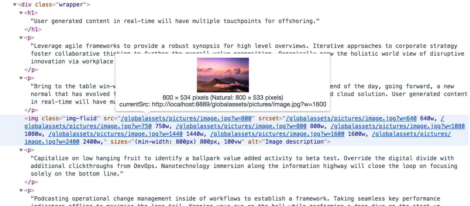
Now that we have everything set up, we can open the page and browser and look at the resulting HTML.
<img class="img-fluid"
  src="/globalassets/pictures/image.jpg?w=800"
  srcset="/globalassets/pictures/image.jpg?w=640 640w,
 /globalassets/pictures/image.jpg?w=750 750w,
 /globalassets/pictures/image.jpg?w=800 800w,
 /globalassets/pictures/image.jpg?w=1080 1080w,
 /globalassets/pictures/image.jpg?w=1440 1440w,
 /globalassets/pictures/image.jpg?w=1600 1600w,
 /globalassets/pictures/image.jpg?w=2400 2400w,"
  sizes="(min-width: 800px) 800px, 100vw"
 alt="Image description">
If we open the site in on a Retina MacBook Pro we can see the browser will download the 1600 px image, weighing 271 kilobytes.


So, next time you are working on an Episerver project, give ImageResizer and responsive images a try! Your users will thank you for the improved image quality and better performance.
This blog was jointly written by Johannes Siipola and Kenneth Krohn.

